Billions of rows of data are generated every day, but data alone doesn’t drive decisions. Stories do.
Think about it: you’ve probably spent hours cleaning data, running analyses, and building dashboards…only to watch decision-makers glaze over your presentation. It doesn’t mean your work wasn’t good enough; it simply means they were unable to connect the dots.
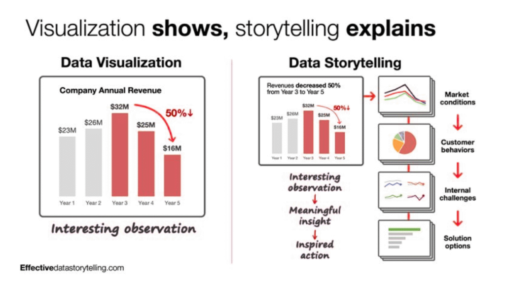
That’s the real challenge. Data isn’t powerful until it’s understood, and understanding comes from context, emotion, and clarity. That’s what storytelling brings. It transforms charts into meaning, and meaning into action.
In this guide, I’ll share step-by-step data storytelling technique, so your analysis not only informs but also influences decisions.
Why data storytelling is so important
Data is the new gold, and every other company seems to be going crazy about being data-driven. As data professionals, it’s our responsibility to give meaning to the numbers the company spends its dime collecting.
Take a simple case of a sales drop. The data shows conversions fell by 15% last quarter. Alone, that’s just a fact. But when you dig deeper, maybe customer behaviour shifted after a price increase, or a competitor entered the market—it adds context to the information. And context builds a narrative, giving meaning to what was once just a number.
The next step is presenting these insights to the company. VPs, executives, and higher management don’t speak the technical jargon you use with your colleagues. They need context as to what impact this information is having on their business and why it matters.
When you communicate in a language that helps them understand and look at the problem in a broader context, it leads to better decisions. The dots start to connect. From what happened to why it happened and what to do next.
What data storytelling means for you
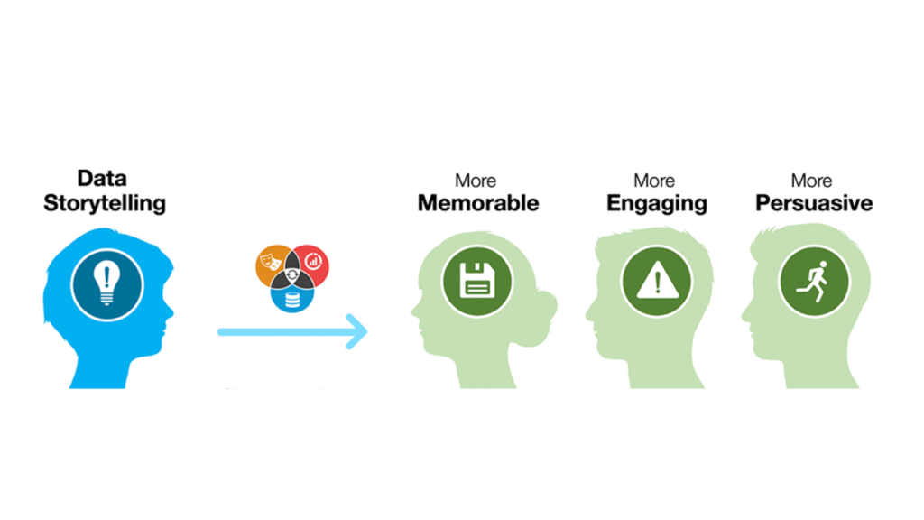
First, data storytelling builds trust between you and the company’s non-data teams and decision-makers. It helps you translate complex findings into clear, relatable insights that anyone can understand, regardless of their technical background. It helps others see the value behind your analysis, trust your conclusions, and feel confident making decisions based on your insights.
And if you’re aiming for a leadership role, this skill sets you apart. Data storytelling gets you noticed.
It positions you as someone who can connect the data and analysis to business outcomes, highly required and valued skills for data leaders. Decision-makers start seeing you as the future data leader.
How to tell stories with data?
There are 3 components of data storytelling
- Data: The numbers and insights you gather.
- Story: The context behind those numbers and the narrative you build around them.
- Visualisation: Presenting the data visually through graphs, bar charts, or dashboards so patterns and trends become instantly clear.
That’ all you need for data storytelling. Let’s look at how you can combine these 3 elements to form a story based on your analysis.
Step-by-step data storytelling technique
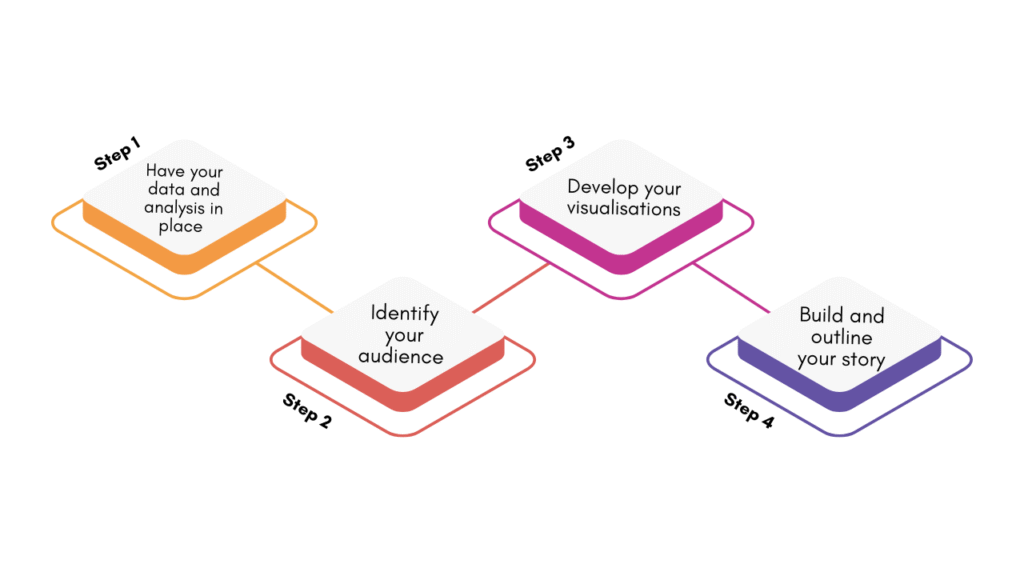
Step 1: Have your data and analysis in place
The first step is to do your main task: The data analysis.
Start with clean, validated data and a reproducible analysis. Verify sources, handle missing values, and document assumptions. Focus on key metrics, segment results, and prepare clear, evidence-backed insights for decision-making.
Step 2: Identify your audience
The goal of your story and how you tell it depends on who’s listening.
Your teammates care about the technical side: the data sources, analysis methods, and tools used. The marketing team wants to know what the data reveals about their campaigns and what actions to take next. Executives, on the other hand, want to see how your insights fit into the bigger business picture and what decisions they have to take next.
You will shape your story around what matters to your listeners. Speak their language, whether that’s metrics, strategy, or impact. It ensures your story aligns with their priorities, making your analysis more persuasive and actionable.
Step 3: Develop your visualisations
A good visualisation requires little to no explanation. Choose visuals that make your message instantly clear. Use charts, graphs, or dashboards that highlight patterns, comparisons, and trends.
Remember, do not overwhelm your audience with details. Keep designs clean, label clearly, and use colour intentionally to draw attention to what matters most.
Step 4: Build and outline your story
Once you know your audience and what they care about, it’s time to shape your story around that
A good story is well-structured. You can always experiment with the flow or the format, but here’s a foolproof, clean structure that works every time:
- Set the stage: Start with context. Introduce the problem and explain why it matters. Use real examples or metrics to ground your story or something that immediately hooks your audience’s attention.
- Present the data: Put forward your numbers and analysis. Focus on what’s relevant to the problem at hand, and keep the visuals simple and digestible. Highlight trends, anomalies, or relationships that reveal something meaningful.
- Explain what it means: Translate your findings into impact. Explain how these numbers affect the business, team, or specific goals. What’s the risk of ignoring this data? What’s the opportunity if they act on it?
- Introduce the solution: Present your recommendations clearly. Outline the action steps and back them with data-driven reasoning. Help your audience see the connection between your insights and tangible results.
Summarise the story by reinforcing the key takeaways. Focus on what your audience needs to remember.
3 Tips to tell a great story with data
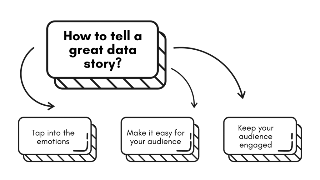
- Tap into the emotions
A good data story connects your insights to what your audience feels or wants. Frame your findings around human impact: fear of loss, desire for growth, or financial gain.
For example, instead of saying “Retention dropped by 10%,” say “We’re losing one in every ten loyal customers.” It makes the data relatable and sparks action.
Here are two questions that will help you uncover the emotion behind numbers
- What does this number mean for real people?
- What impact or emotion is connected with this data?
- Make it easy for your audience
Ever been into a conference room where everyone seems disengaged from the presentation? That’s a common sight, and it happens when the information presented is either irrelevant to the audience or too complex for them to grasp.
You will know what’s irrelevant or out of the domain of your audience if you have considered who they are.
Tailor your story to what the listeners already know and build from there. Keep your visuals and language simple, focusing on one main point per slide. End with a quick takeaway to reinforce the key message. The easier your story is to understand, the more likely it is to be remembered and acted upon.
- Keep your audience engaged
The best way to not lose your audience is to turn passive listeners into active participants.
Keep your audience involved throughout the story. Pause to ask for feedback or run quick polls to gauge reactions. Invite questions at key moments to make sure your message lands the way you intend.
Final thoughts
The ability to make people see what the numbers mean and feel is data storytelling. It’s a powerful skill that you can learn to transform your analysis into stories that drive action and shape decisions. It’s a critical skill for aspiring data leaders like you.
If you want to fast-forward your data career, join my 8-week Data Mentorship Program. It gives you the right skills and puts you in the right mindset to take the next step, the leadership step in your data career. Have some concerns? Book a 15-minute consultation with me.

![7 Practical ways to better use AI in CRM [ CTO’s guide]](https://feriotti.com/wp-content/uploads/2026/02/1-3.png)